ITCFranklinGothic LT Com DmXCm
字體在線預覽(字體轉換器控制臺)
生成的圖片將顯示在這裏
字體在線預覽生成的圖片僅供用於學習和欣賞,請勿用於商業用途(標註免費可商用的字型除外)
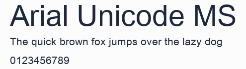
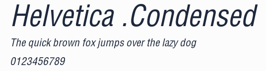
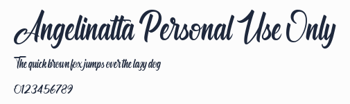
字型預覽圖

字型資訊
- 字型名稱: ITCFranklinGothic LT Com DmXCm
- 字型風格: Regular
- 字型標識: Linotype GmbH:ITC Franklin Gothic LT Com Demi Extra Compressed:2006
- 字型全稱: ITC Franklin Gothic LT Com Demi Extra Compressed
- 版本: Version 2.00; 2006
- 字重: 400
- PostScript名稱: FranklinGothicLTCom-DmXCm
- 字符數量: 386
- 版權: Part of the digitally encoded machine readable outline data for producing the Typefaces provided is copyrighted © 2004 - 2006 Linotype GmbH, www.linotype.com. All rights reserved. This software is the property of Linotype GmbH, and may not be reproduced, modified, disclosed or transferred without the express written approval of Linotype GmbH. Copyright © 1995 Adobe Systems Incorporated. All Rights Reserved.
- 設計師: David Berlow
- 製造商: Linotype GmbH
- 描述: Franklin Gothic was designed by Morris Fuller Benton for the American Type Founders Company in 1903-1912. There were already many gothics in America in the early 1900s, but Benton was probably influenced by the popular German grotesks: Basic Commercial and Reform from D. Stempel AG. Early types without serifs were known by the misnomer "gothic" in America ("grotesque" in Britain and "grotesk" in Germany). Franklin Gothic may have been named for Benjamin Franklin, though the design has no historical relationship to that famous early American printer and statesman. Benton was a prolific designer, and he designed several other sans serif fonts, including Alternate Gothic, Lightline Gothic and News Gothic. Recognizable aspects of Franklin Gothic include the two-story a and g, subtle stroke contrast, and the thinning of round strokes as they merge into stems. The type appears dark and monotone overall, giving it a robustly modern look. Franklin Gothic is still one of the most widely used sans serifs; it's a suitable choice for newspapers, advertising and posters. ITC Franklin Gothic® is a large set of fonts based on Benton's work, with two skilled artisans behind the revival and expansion. In 1980, Victor Caruso re-drew the original Franklin Gothic and designed several more weights, and in 1991, David Berlow added several condensed and compressed weights. With dozens of weights and styles, this perennial favorite is ready for duty in any situation from tight corners on printed documents to powerhouse arenas on websites. Another family with a similarly useful design is Trade Gothic.
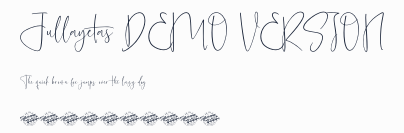
字符映射圖

字型下載
本站下載的字型如用於商業目的,請聯繫作者獲得授權,(免費字型專欄下的字型可免費用於商業用途)。若侵犯了您的權利,請聯繫我們(fontsvip@gmail.com),我們將立即處理,發送郵件請提供本頁網址,加快處理,本頁地址:https://www.xiazaizixing.com/82161.html
TAGS:
暫未開放評論