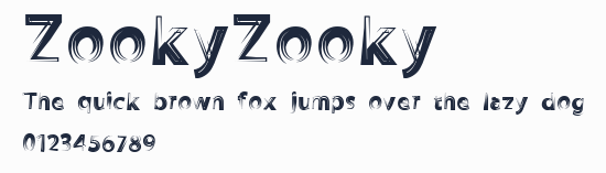
ZookyZooky
字體在線預覽(字體轉換器控制臺)
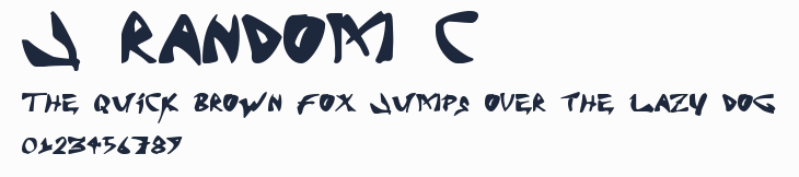
生成的圖片將顯示在這裏
字體在線預覽生成的圖片僅供用於學習和欣賞,請勿用於商業用途(標註免費可商用的字型除外)
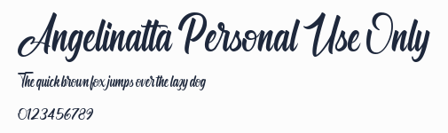
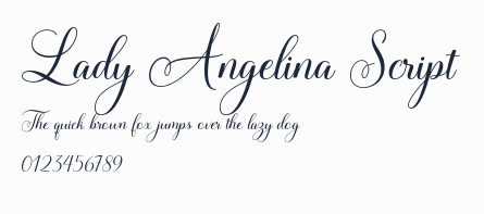
字型預覽圖
字型資訊
- 字型名稱: ZookyZooky
- 字型風格: ZookyZooky
- 字型標識: 1.000;pyrs;ZookyZooky
- 字型全稱: ZookyZooky
- 版本:
- 字重: 400
- PostScript名稱: ZookyZooky
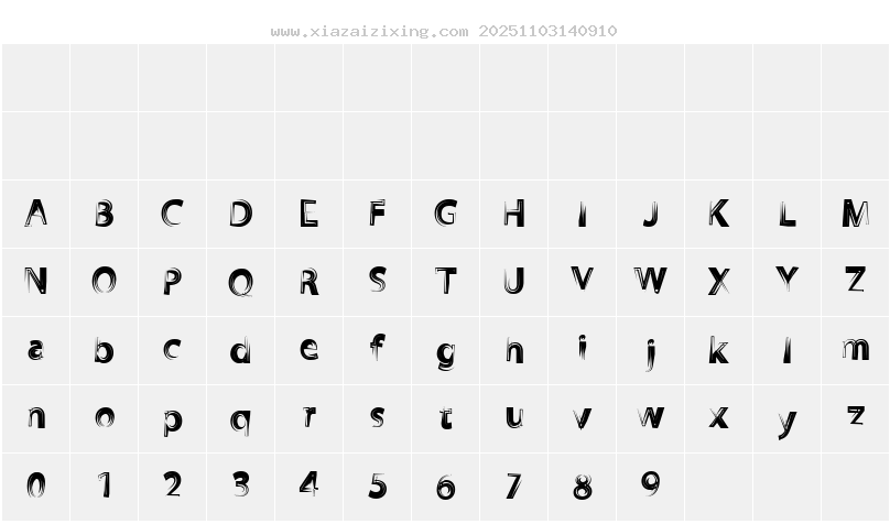
- 字符數量: 103
- 版權: ©THOMAS CANALE, CANALE STUDIO, INC.
- 設計師: ©THOMAS CANALE 2011
- 製造商: THOMAS CANALE
- 描述: Setting type has been an occupation and a passion of mine over the last 30 years. After completing some schooling at Cooper School of Art in Downtown Cleveland I accepted a position at Peto's Type House. Back then, the Cleveland Press still set type with 'Hot' lead. I know, I know, this dates me, but the facts are the facts. PhotoType was in it's infancy with the Linotronic 5700 being top-of-the-line technology in Photo type setting. My job at Peto's was more modest, among other things, I was hired to set headline type on what was called a 'Typositor'. It was still photo type setting but for headlines only. Letters had to be set (exposed), one letter at a time. A single headline of lets sayÉ15 words or so could take an hour or two to completely finish for paste-up, that's right, I said paste-up. That should really date me!! By doing this day in and day out (for hours on end) I gained a "close-up' appreciation for letterforms and spacing. Ernie Peto would also quiz me on identifying type by name. It was an interesting 18 months to say the least. There have been lasting effects on my appreciation of letterforms thanks to this experience. Over the years, there have been spin offs of wood type, Times Roman, Helvetica, etc. Seems to me like we are just going over the same ground over and over and over again. What interests me is not the 'sameness' in the letterforms or their 'invisibility' in the graphics world. Some fonts are used to be 'invisible'. What I mean by this is that they are merely a communication tool to deliver the authors' / writers' message. the artistry in the forms lies in their ability to stay invisible and be easy to read. But their 'uniqueness' and how that difference translates to the printed page. There are many ways of looking at letterforms. We can look at the beauty of the individual letters themselves. Commenting on the curves of a upper case 'A' or a lower case letterform. Or we can look at them as a 'unit' and how that translates within a block of written text. It is this uniqueness that I am looking for in the fonts I design. I do look at each individual letterform and revel in the beauty of the forms and lines. But I also want to create a Font that when written out will display some unusual and unexpected characteristics when in a large block of text. Look for different line weights and forms in my font glyphs. The idea here is to allow the printed page to display uniqueness in contrast.
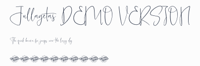
字符映射圖
字型下載
本站下載的字型如用於商業目的,請聯繫作者獲得授權,(免費字型專欄下的字型可免費用於商業用途)。若侵犯了您的權利,請聯繫我們(fontsvip@gmail.com),我們將立即處理,發送郵件請提供本頁網址,加快處理,本頁地址:https://www.xiazaizixing.com/74381.html
上一個字型:ZooWoodcutsM
下一個字型:Zomnk
TAGS:
暫未開放評論