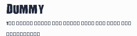
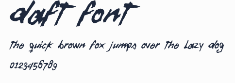
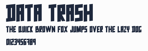
Ancient G Written
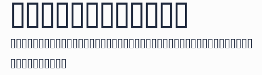
字體在線預覽(字體轉換器控制臺)
生成的圖片將顯示在這裏
字體在線預覽生成的圖片僅供用於學習和欣賞,請勿用於商業用途(標註免費可商用的字型除外)
字型預覽圖
字型資訊
- 字型名稱: Ancient G Written
- 字型風格: Regular
- 字型標識: Ancient G Written:Version 1.00
- 字型全稱: Ancient G Written
- 版本: Version 1.00 October 2, 2008, initial release
- 字重: 400
- PostScript名稱: AncientGWritten
- 字符數量: 118
- 版權: by Gen Aris -Inspired by fan fonts Anquietas, Anc Hand, & my personal prefs . . .
- 設計師: Gen Aris
- 製造商: Gen Aris
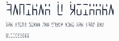
- 描述: A variant of the ANCIENT glyphsets used by the Ancients in Stargate: Atlantis. This version is designed to provide a HANDWRITTEN variant of ANCIENT G MODERN, which is my extended character version of the machine-print styled revision of ANCIENT. The purpose with this revision, as in Anc. G Modern, is to CREATE PUNCTUATION and ADDITIONAL CHARS/SYMBS to facilitate better clarity when applying this font to English documents which contain punctuation and other characters. Of course, this WRITTEN variant stylizes the glyphs to facilitate hand writing them more readily. Some glyphs here are more identical to the source than is possible with others but hopefully, once used a bit, will become intuitive for those familiar with Ancient and or Ancient G Modern. Per show canon, the Ancients did not appear to use punctuation marks, nor did they distinguish between Upper/Lower case. Again, to facilitate use of this font in regular documents or even as the Windows font (for menus etc) I have created CAPITALIZED VARIANTS which are identical to the lower case except I added a SQUARE DOT FLOATING ABOVE TOP LEFT of CAPPED KEYS. Passwords and user names sometimes use L/case and U/case letters, so it is necessary to distinguish the 2 cses in daily life here on Earth! My logic for the design of new characters is as follows: Letters are made up of white/black blocked spaces dividing on a 3 wide by 4 high grid. A few letters make use of subdivsions within the grid. In canon, all numerals share a centered descender "tail" unlike the letters. I took this further, by giving all punctuation mark glyphs a centered ascender on top, like an upside down version of the numeral tail -- an "antenna" if you will. This should make it easier to become facile at visually distinguishing punctuation marks from letters or numbers. Some punctuation marks or symbols are used in numeric/math contexts partly or wholly. So, math or number oriented and shared alphanumeric/math punctuations are given the "tail" of numerals and the "antenna" of punctuation/symbols to so indicate the context. The numbers, in canon, have a slightly more subdivided or even an altered grid used in their design than do the letters. Here, as well, both numbers and punctuation/symbols share this more prominent use of subdivision or underlying grid different from the letter glyphs. Overall, I tried to adhere to the digital, techno-sensibility of the glyphs as seen in SG-1 and SGA while striking a balance with variations of weight and tone so as to be reasonably attractive, while remaining aware of the need to make this practical and functional. How well I fared toward my goals, I leave to you to decide. :) Gen Aris genaris@gmail.com
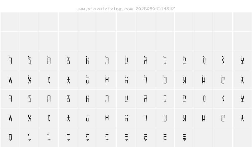
字符映射圖
字型下載
本站下載的字型如用於商業目的,請聯繫作者獲得授權,(免費字型專欄下的字型可免費用於商業用途)。若侵犯了您的權利,請聯繫我們(fontsvip@gmail.com),我們將立即處理,發送郵件請提供本頁網址,加快處理,本頁地址:https://www.xiazaizixing.com/39077.html
上一個字型:Ancient G Modern
下一個字型:Ancient Black WF